 ALINE
ALINE
ALINE
ALINE
Logo, color, type, voice, and motion, matched one-for-one to aline.network. Use it for decks, partner placements, press, social, and anything else that carries the name.
October 2026 · Click any swatch to copy its value
An angular A built from a green arrow and a graphite negative-space corner. It points forward and reads at 24 pixels. Never redraw it; use the files below.
All caps, Archivo at width 125 and weight 700, letter-spacing 0.18em. It's the same setting as the site header and footer. The name is always ALINE, never Aline or A-Line.
The mark sits about 1.9× the wordmark's font size, with a gap of 0.8× (28px mark, 15px word, 12px gap in the site header). Use it for headers, splash screens, and partner placements.
Keep at least 8px of empty space on every side, more as the mark grows. Nothing else goes inside the dashed line.
24px is the floor. Below that the graphite corner closes up.
Place it on Paper, Night, or Kelly green. On Kelly, use the white reverse.
Add drop shadows, outlines, or gradients to the mark itself.
Keep the exact two tones: Kelly #009A44 and Graphite #6E6E6E (#8A8A8A on Night).
Recolor, rotate, skew, or stretch it, or set the wordmark in any face other than Archivo Expanded.
/assets/logo.png), and the app icon all draw the arrow in Kelly #009A44. The older limes (#41AE05 and #61AE36) are retired; if one turns up in an old deck or export, swap in the files below. Use the SVG wherever you can.One ownable green, used as a signal rather than a fill. Ink carries the buttons and the words. Green marks what's aligned, live, or nearby: an eyebrow, a pulsing dot, one emphasized word. If taking the green away loses no meaning, use ink.
Night, a 165° fall from Night 2, two Kelly glows (22% top right, 14% bottom left), and a fine grain. 28px corners, inset from the page edge.
Four faces, each with one job. Archivo Expanded speaks for the brand, Instrument Serif quotes people, Hanken Grotesk carries the reading, and JetBrains Mono labels the signal. All four are free on Google Fonts.
Tell ALINE what you're looking for: an investor, a client, a cofounder, a hire. It finds the professionals around you who are looking for you too, and puts you in touch while you're still in the same room.
Green, never italic. An <em> in a headline turns Deep on light and Soft on dark. One or two words, once per headline.
The marker underlines a single closing word. Use it once per view, at most.
The muted tail sets a closing aside in Ink Faint so the main claim lands first.
ALINE talks about the person you're about to meet, not the technology that found them. Plain words, present tense, second person.
Title case, two sentences, with the full stop on each. Use it under the lockup, as a sign-off, or on its own. Don't paraphrase it.
Every action is a capsule. Cards are flat Paper 2, with no border and no shadow. A shadow means something is floating above the page: the phone, a match chip, the QR card.
Primary is Ink, not green, and goes Deep on hover. Ghost is a hairline. On Night, the primary flips to Paper.
The eyebrow pill carries a pulsing dot; floating chips are frosted Night Card.
Inputs are Paper with a hairline and a soft lift. Suggestion chips are hairline pills in Ink Muted.
A Kelly numeral in Archivo, an Archivo title, Hanken body. Cards lift 4px on hover; buttons lift 1px.
Content tops out at 1280px. Dark panels sit 16px in from the viewport (8px on phones).
The brand's motifs all say the same thing: someone aligned is nearby, right now. Motion is slow, eased, and optional.
Concentric rings expand from a point and fade, one every 1.25s on a 5s loop. Hairlines in Soft at 28%.
A 6px dot that breathes between full and 35% opacity every 2.4s. It means "live." Pair it with a mono label.
Real-sounding intents swap every 2.6s with a short fade and rise. Concrete, lowercase, ends with a period.
cubic-bezier(.22, 1, .36, 1) for everything that moves into place; ease-in-out for loops.
Know who is aligned before walking over.
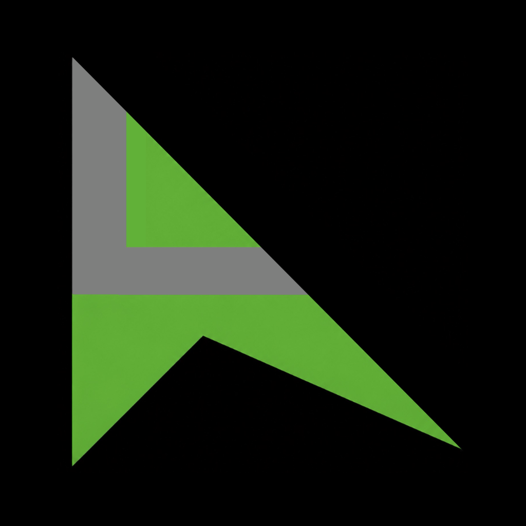
The shipped icon: the two-tone mark on black. Work from the 1024×1024 master. Don't round the corners yourself; iOS and Android apply their own mask. Never put the wordmark or lockup on the icon.
On the web, use single-color line or solid glyphs drawn in currentColor, sized 18-22px beside text. In the iOS app, use SF Symbols. Zero emoji, anywhere.
The angular A can stand alone as a brand glyph in empty states and loaders, always in its two tones.
Questions or a placement to approve? hello@aline.network